

When you are proud of your business, it is incredibly tempting to put absolutely everything on your homepage. You want your visitors to see all your services, read your company history, check out a dozen testimonials, and watch a welcome video the second they arrive.
But packing your website to the brim usually has the exact opposite effect. At Topsia Website Designs, we often have to help clients take a step back and start deleting things. When a user lands on a cluttered, overwhelming website, they don’t stick around to read it all—they get stressed out and immediately leave.
(Quick design rule: If everything on your screen is fighting for attention, absolutely nothing stands out. Less is almost always more!)

1. The Paradox of Choice
Psychologists have long studied a concept called “decision fatigue.” If you give someone three clear options, they will confidently pick one. If you give them thirty options, they will become paralyzed by indecision and choose nothing at all.
If your website has two pop-ups, five competing offers, and a menu with twenty links, you are confusing your potential customers. A high-converting website acts like a digital tour guide, gently directing the user toward one single, primary action.
2. The Hidden Power of Whitespace
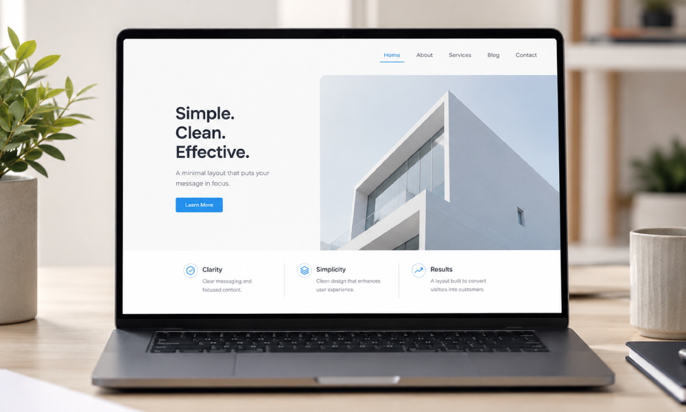
Many business owners look at empty space on a web page and see wasted real estate. In professional web design, this is called “whitespace” or “negative space,” and it is actually your most valuable asset.
Whitespace acts as visual breathing room. It separates different ideas, makes your text highly readable, and naturally draws the user’s eye directly toward your most important elements—like your primary “Contact Us” or “Buy Now” buttons.
3. How to Clean Up Your Digital Storefront
Cleaning up a messy website doesn’t necessarily mean deleting all your content; it means organizing it thoughtfully so the user only sees what they need exactly when they need it.
- Trim your main menu: Keep your top navigation incredibly simple. Move secondary links (like your Privacy Policy or detailed company history) to the footer at the bottom of the page.
- Use clear visual hierarchy: Make your main headline large and bold, and keep your paragraphs short. Break up heavy blocks of text with bullet points and subheadings.
- Focus your Call to Action: Pick the one thing you want a visitor to do on that page and make that button impossible to miss.
Let Us Streamline Your Website
If your website feels crowded, outdated, or chaotic, it is likely costing you valuable leads. A clean, modern redesign can completely transform how customers perceive your brand and interact with your business.
At Topsia Website Designs, we specialize in crafting beautiful, minimalist, and highly functional WordPress sites. We know exactly how to organize your content so it looks professional, loads incredibly fast, and drives real conversions.
Ready to give your digital storefront the makeover it deserves? Reach out to our team today, and let’s build a website your customers will love to use!