

When choosing the color palette for your new business website, it is tempting to just pick your personal favorite colors. Maybe you love a sleek, dark aesthetic or vibrant, energetic neon tones. But in the world of professional web design, colors are much more than just a visual preference—they are a powerful psychological tool.
At Topsia Website Designs, we don’t just choose colors because they look pretty. We use them strategically to influence how potential customers feel the second they land on your page. The right color palette can instantly build trust, direct attention, and significantly increase your online sales.
(Quick tip: If your website colors are inconsistent with your physical branding, storefront, or logo, it creates a subconscious sense of distrust in your visitors’ minds.)
1. The Subconscious Language of Color
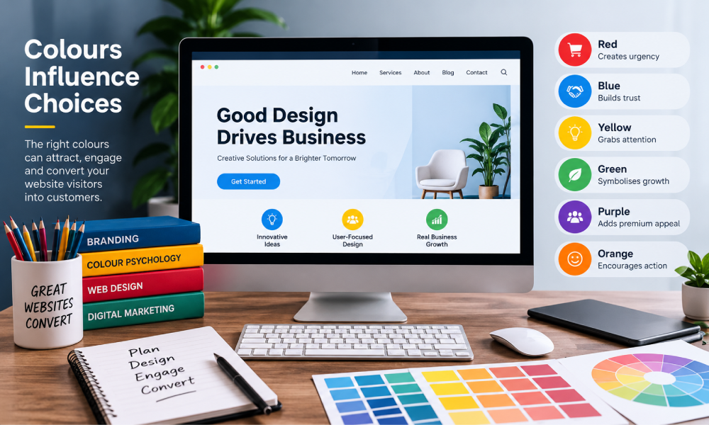
Every color triggers a specific emotional response. Major brands spend millions researching this, and your small business can leverage the exact same psychology to connect with your target audience.
For example, blue is overwhelmingly used by banks, tech companies, and service providers because it subconsciously communicates security, trust, and professionalism. Green is heavily associated with wealth, health, and growth. Red creates a sense of urgency and excitement, which is why it is frequently used for clearance sales and fast food.
2. Using Contrast to Drive Action
Even the most beautiful color palette will fail if it lacks one critical element: contrast. If your website background is light gray and your “Buy Now” button is a slightly darker gray, it is going to blend in completely. Visitors shouldn’t have to hunt for the next step.
In web design, your Call to Action (CTA) buttons must stand out from the rest of the page. By using a bold, contrasting “accent color” exclusively for your buttons and links, you naturally guide the user’s eye exactly where you want them to click.
3. Accessibility is Non-Negotiable
Color choices aren’t just about emotions; they are also about usability. If your text color doesn’t contrast enough with your background color, people with visual impairments or those viewing your site on a sunny day via mobile simply won’t be able to read it.
- Check your contrast ratio: Dark text on a light background is the gold standard for readability.
- Don’t rely solely on color: If you are displaying an error message on a form, don’t just make the box red—include an icon and text explaining the error.
- Keep it simple: Stick to 2-3 primary brand colors to avoid overwhelming your visitors.
Let Us Design a Brand That Converts
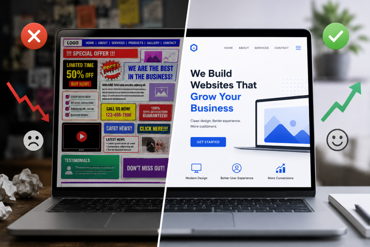
Your website’s design speaks volumes about your business before a customer even reads a single word. If your color palette is outdated, chaotic, or confusing, it is likely costing you valuable leads.
At Topsia Website Designs, we combine stunning aesthetics with proven consumer psychology to build websites that don’t just look amazing—they actively grow your business. We handle the design, the layout, and the underlying strategy so you can focus on your clients.
Ready for a website that perfectly represents your brand? Reach out to our team today, and let’s start designing!